Data can be presented in a number of different ways and tables with their arrays of numbers often hide the real story. The recent explosion of infographics suggests that perhaps people understand complex data when portrayed visually. Edward R. Tufte, in The Visual Display of Quantitative Information, and other works, shows how powerful data can be when portrayed well.
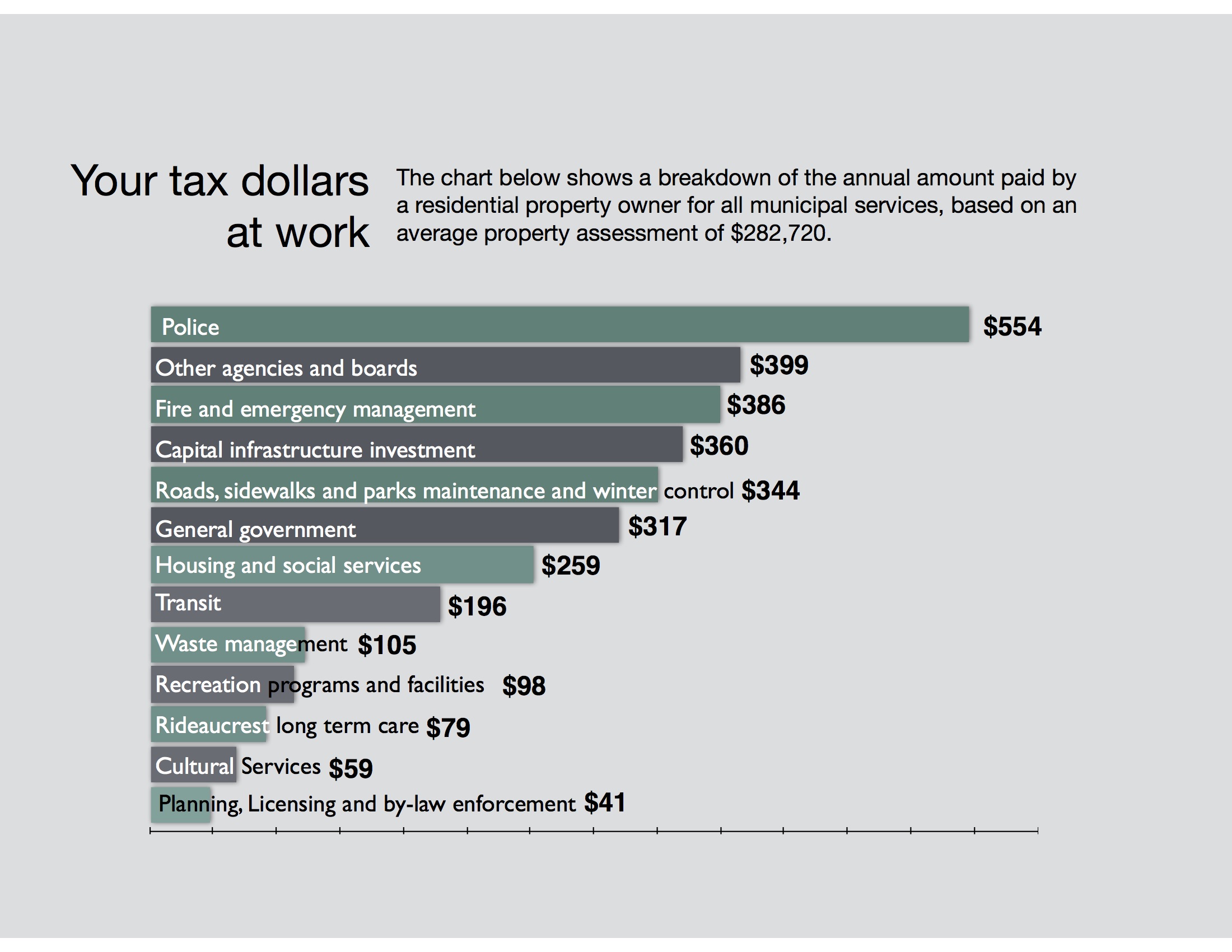
But sometimes, whether by design or not, data can be shown visually and deceive. Last week along with my tax bill, I received an insert from the City of Kingston called 2015 Property Tax Information. Along with the noble council priorities, links to the city website about tax rebates was this chart:

The problem with this chart is that it’s deceptive. Depending on your perspective, it either exaggerates the amount spent on such things small expenditures such as cultural services or dilutes the single largest expense of the city, the police. The numbers are accurate but the visual seems to suggest a greater equality than there actually is.
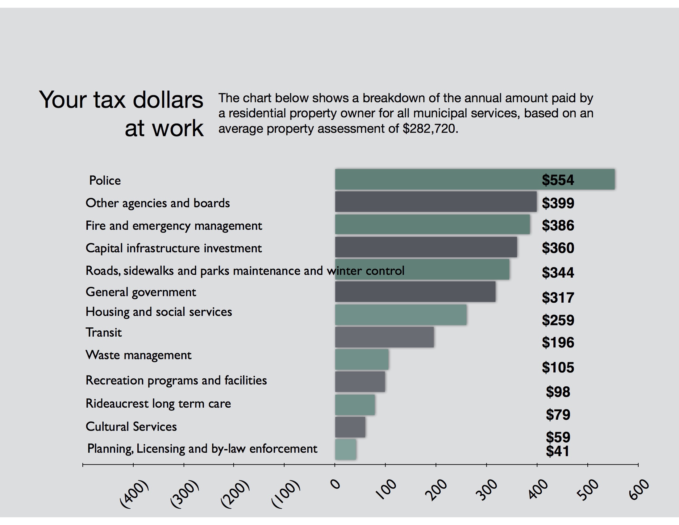
When you put the data on a graph, it should look like this:
Even taking into account my limited graphic design skills, it’s pretty clear how the data from the City take on a completely new meaning. I’m not going to infer any intention in this misrepresentation but wonder whether this misleading graphic is by design or accident.
Post script:
After posting this on Twitter, the City of Kingston responded via Twitter: Here is what the official Twitter account of the city of Kingston had to say:
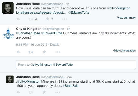
I think the city is confused again. What they really meant is that the axis is in six increments like I have shown below. The problem is that they have filled in the X Axis from -500 to 0 — likely to make it more readable. (Imagine the chart below with the green and grey covering the words and you have what they did.) In doing so, they have completely distorted the very data they meant to present and went against some very basic statistical principles.
I have no doubt that city public servants are, like the rest of us, overworked and occasionally make errors. I don’t fault them for that. What surprises me is that the city does not understand what my undergrad students should know about basic statistics. Maybe in the future, I will give my students these data and ask them to present them in more a meaningful and truthful way. I’d be curious to see what they come up with.
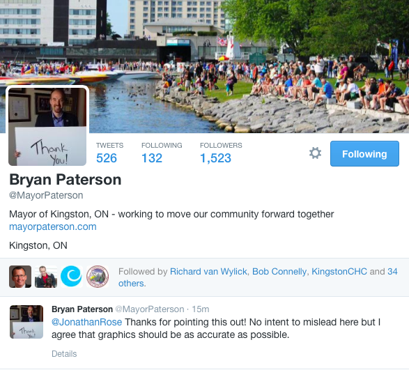
I’ll give @MayorPaterson the last word:
Post Script: This post discusses how the axis on a graph can be used to deceive. While I am prepared to believe that this was an honest mistake, in other cases the intention is much less clear. Take for example the ideological think tank, the Fraser Institute, which is given charitable status because they are engaged in ‘education’. What happens when they present data that furthers their ideological agenda and is clearly deceptive? Check out a blog post by Joey Devilla to see how egregious that deception can be.